
Appearance
Brand
This is where your shop starts looking like yours: your logo, your colours, and your lettering.
Open Settings from the menu, then choose Brand. Changes here appear on your live shop as soon as you save, so it is worth having a look at your storefront afterwards.
Logo & brand icon
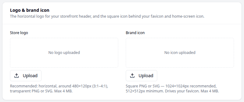
You can upload two pictures, and they do different jobs.
Store logo sits at the top of your shop. A wide shape works best — around 480×120 pixels, roughly three or four times wider than it is tall. PNG, JPEG, WebP or SVG, up to 4 MB. A transparent PNG or an SVG looks cleanest.
Brand icon is the small square picture people see on a browser tab, or when they save your shop to their phone screen. It must be square: 1024×1024 pixels is ideal and 512×512 is the smallest that works. PNG or SVG only, up to 4 MB.
If you only have one picture, upload it as your Store logo and come back to the icon later.
Brand colours
You choose two colours here — a Brand color and a Button color — and Biponix works out every other shade from those two on its own. You do not need a full set of colours, and you do not need to know anything about matching them.
Saving updates your live shop, your emails and your invoices straight away.
There is a live preview below them, showing a button, a link and a badge in the colors as you pick them — so you can see how they will look before you save.

Background & text
Background is the colour behind your pages, and Text color is the colour of your writing.
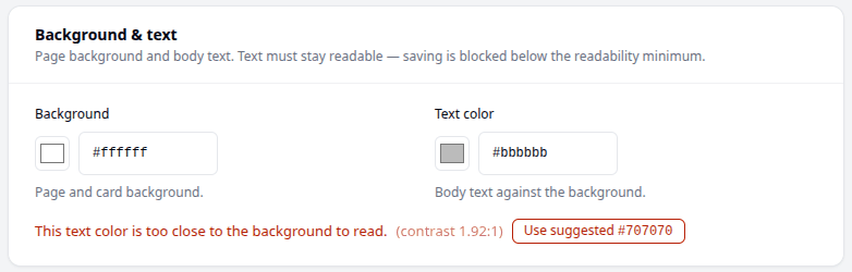
These two have to work together, so Biponix checks them as you pick. If they are too close to read comfortably, you will see:
This text color is too close to the background to read.
You cannot save until it is fixed — but next to that message is a Use suggested button that picks a readable colour for you. One click and you are done.
Pro tip
Look at your shop on a phone once you have chosen. Colours that look fine on a big screen in a bright room can be hard to read on a phone outdoors, which is where most of your customers will be.
Button label contrast
Your buttons have writing on them, such as "Add to Cart". This setting decides what happens when your button colour makes that writing hard to read.
- Standard — maximum readability. Biponix changes the writing to whichever colour is easiest to read, so it may use dark writing where you expected white. Recommended.
- Brand — vivid labels. The writing stays bright, usually white, even on a button colour where it is harder to read.
If you are unsure, leave it on Standard.
Status & sale colors
These are the colours for things like errors, success messages, low stock and sale prices. You cannot change them here, and that is on purpose — they mean the same thing in every Biponix shop, so customers recognise them.
Typography
Heading font is the lettering for titles, and Body font is the lettering for ordinary writing. Pick from the list.
Two different fonts can look good together, but one font used for both is a safe choice and never looks wrong.
Saving
Nothing changes until you press Save. Discard puts everything back.
What next
Your shop now has your name and your look. Next comes Payments, so customers can pay you.